
For the graphs below, match the graph to the description below
For the graphs below, match the graph to the description below. (2 each)
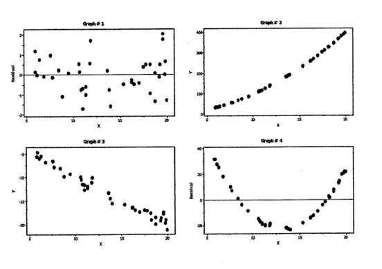
a.) Which graph below indicates a negative correlation?
b.) Which graph indicates that X2 should be added to the regression model?
c.) Which graph suggests the regression fit is "as good as it gets"?
d.) Which graph suggests a transformation such as In(Y) versus X is the appropriate regression model?
Solution:
(a) #3
(b) #4
(c) #3
(d) #2
Stats Solution Summary
Observe that it is usually possible to assess the degree of the linear relationship between two variables by looking at the corresponding scatterplot. A linear association is indicated by having the points of the scatterplot relatively tightly assembled around a line.
A lack of a pattern, or the existence of a non-linear, curvilinear pattern would be an indication of a lack of a linear association.
Related Content

Combining Efforts with a Statistics Expert - StatisticsHelp

Statistics Help: Where To Find it? - StatisticsHelp
